Cheese and Design...
 What a wonderful Idea, I thought; they are going to reintroduce the long forgotten Beirut International
 The marathon was held, and to me, it was a grand success, and well covered by the media.
....
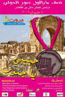
Time passed, and then a couple of weeks back, I got this advertisement poster by email:
Another race was to going to be held in Sour (
Despite the fact that it should have, again struck me as good news, my reaction was totally different. Logically, it should have merited the same reaction, thrill and respect, the Beirut Marathon reaped from me. Instead, I was both appalled and speechless! By God, who the hell designs these posters? I just want to know, who was it that got this ingenious idea of clumsily hanging a giant, disproportionate medal, on historical ruins...
Here's how I see it happening in the graphic design department:
- How would you like the poster designed?
- It's a race, so put in a medal... We also want to remind the international community that we have a great history, and that we have Phoenician origins.
- Okay! I'll emboss a Phoenician ship on the medal. Is that all?
- Yeah well, make the medal bigger... Oh yes, in Sour, we have ruins... put in some ruins, and state that we got rid of the landmines.
- mmmm what else...
- The south, we need to evoke the south! Try to find some supportive words for the south... It suffered a lot and we have to acknowledge that in every thing we do, and every message we send out.
- But we already wrote that the race is in Sour.
- No no, I don't just mean the South as geography!
- ya habibi ya jnoub? (my beloved south)
- Yes! I guess that will do.
- There is still something missing though, I can't put my finger on it...
- What?
- I don't know!
- I think it is enough! It is already crowded.
- Wait! I found it! Fuchsia!
- mmmm Fuchisa... Like that?
- Yes, I like it... print it!
m.i.n.i.m.a.l
m.i.n.i.m.a.l
m.i.n.i.m.u.m

3 Comments:
:) yeah it's..not good
well at least the marathon is back
honestly, it's like they weren't... inspired!
that's the least one could say...
Post a Comment
<< Home